Modern living room design, trends in decorating with color
Follow
Popular

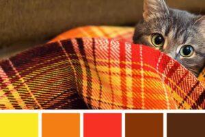
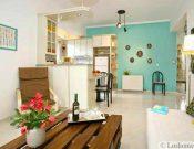
Yellow colors, earthy red, beige, dark and light brown color shades are perfect for room decorating in 2018 and have the power to stay. The Earth Dog year brings the attractive natural color palette which blends beautifully with neutral color tones and vibrant accents. Yellow shades, berry red, pinkish purple, green, turquoise, and light blue pastels associate with nature, so interior design color schemes which include these hues are pleasant and comfortable. Lushome presents the modern color palette of yellow, deep red, and purple, and ten fresh color schemes for creating stylish and beautiful interior design for 2019.
If the light yellow-gray-beige palette looks too pale to you, use the modern color schemes and the 60-30-10 rule for mixing three or four hues in your interiors. The fourth color is perfect for accents that will make your interior design bright and exciting. Crimson, orange, mustard, muted pink, soft blue or green, lavender, and deep purple color hues complement light yellow color shades and pastels, giving a stylish, fresh look to the modern interior design. Burgundy, earthy reds, soft pinks, grayish and warm purple pastels are 2018 trends in decorating also.
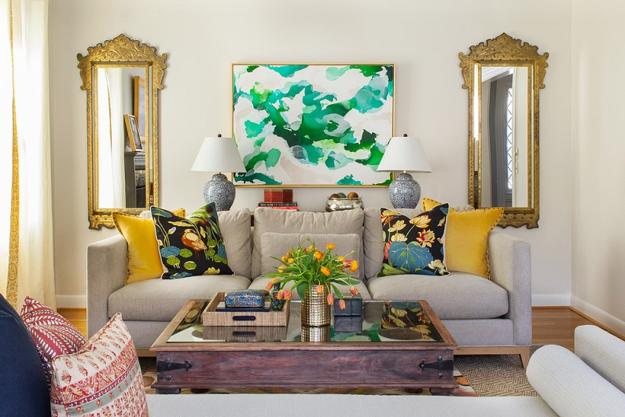
The latest hues mix with all neutral color tones and shades. Black, white, gray color and beige look fabulous with rich golden shades and vibrant accents, like turquoise, sky-blue, fresh green, pink, and lavender. To enhance the original and modern interior design you can add fashionable prints. Attractive ornaments, inspired by natural themes, textiles with green leaves and large flowers, geometric and oriental decoration patterns are perfect for your room decorating in 2019.
Modern color palette


Matching interior design colors, wall paint, home furnishings
Yellow color in decorating, sunny color psychology
Color design ideas to balance modern interiors
10 interior design color schemes
60-30-10 is a timeless decorating technique that can help you to select hues and use the interior color schemes. The proportion creates balance in the primary and accent color combinations used in interior design. This rule is straightforward and mistake-proven.
The first color is the primary color which is for 60% of color design in your room. Walls and large furniture pieces in the primary color produce a backdrop for smaller details and anchor the room. Your 30% is the secondary color. Decor accessories, small furniture, curtains and bed linens, an accent wall are just a few examples of usage of the second hue. The secondary color supports the main color while creating attractive contrasts and setting the mood in the space.


Your 10% or the third color in the color schemes. It is your accent color which adds interest to the basic two-color combinations. Vases, flower pots with plants, painted chairs, throw pillows, artworks, lamp shades, small decorations, wall clocks, mirror frames or candles are decorative accents that design bright and harmonious interiors.


The 60-30-10 rule allows using four colors also. There is the primary color for large surfaces and furniture pieces, the second color for small elements of the interior design, and two more interior colors for accents which balance, brighten up, and enhance the decor. It is easy to use three-color schemes in any space, but the additional accent color creates the truly unique, professional, and sophisticated interior design.
by Ena Russ
03.06.2018
Get inspired
Mothers Day crafts and making simple floral arrangements for table decoration are great ways to show your love. Beautiful flowers make...
Edible Decorations for Sharing Easter Meal with Kids, 25 Creative Presentation and Food Design Ideas

Easter ideas inspired by meaningful images and familiar characters bring creative food design ideas for gorgeous presentation that makes Easter meals...
Birds’ nests are wonderful, meaningful and charming Easter decorations. Birds’ nests vary in shapes, materials and design styles, and provide great...
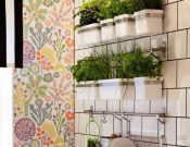
Mini garden with edible herbs in your kitchen is a fabulous way to save money on food and decorating. Here is...
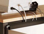
Modern cable organizers, wire holders and tags add more organization to office desk and create clutter-free, beautiful and comfortable atmosphere for...
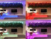
Bright green wall design and changing color lighting design added by architect Rudolph Lesnak to contemporary apartment ideas create unique and...
Seasonal ideas

More from interior colors

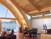
Bright home interiors and amazing views of the ocean make this beach house a dream place. Large windows, light, neutral room...